The Cycle of Seasons: Adapting Your Palette to Each Season’s Offering
As nature sways through the dance of seasons, the colors in our gardens change their tune as well. Like a piece of living artwork, your vibrant garden design can adapt and evolve with each turn of the earth. 🌏🌸❄️
Embracing Spring’s Palette: A Fresh Start to Your Garden Canvas
Spring offers a chance for renewal and a fresh slate for your garden. During this time, soft pastels and delicate hues come into play. Think pinks, light blues, and creamy yellows. Plant tulips, cherry blossoms, and daffodils to capture this gentle beginning.
Choosing Early-Blooming Perennials
Early-blooming perennials like Hepatica, Primrose, and Bleeding Hearts are perfect for capturing the spirit of spring. These flowers not only look beautiful but are also low-maintenance, making them ideal for beginner gardeners.
The Vibrance of Summer: Your Garden in Full Swing
Summer is the time when your garden is in full flourish. Bold colors like red, yellow, and orange dominate the landscape. You can opt for flowers like roses, lilies, and sunflowers to make your garden come alive.
Incorporating Texture and Shape
Let’s not forget about the texture and shapes, which can add another layer to your colorful masterpiece. Consider planting sunflowers near spherical Alliums to create an interesting visual dialogue.
The Cozy Hues of Autumn: A Time for Reflection and Preparation
Ah, autumn—a season of cozy blankets and warm mugs of apple cider. 🍂 Your garden can reflect this comfort through shades of brown, gold, and crimson. Chrysanthemums and asters are wonderful for this season.
Prepping for Winter
Use this season to prepare your garden for winter. This involves cutting back perennials, removing dead annuals, and mulching.
Winter’s Subdued Shades: A Time for Quiet Beauty
The winter months offer a subdued, peaceful color palette. Think whites, blues, and grays. While flowers may be scarce, evergreens and winter berries can add bursts of color.
Adding Architectural Elements
Consider adding a garden sculpture or a bird feeder. These elements can serve as focal points in a season when the plant life is less vibrant.
🌱 Pro-Tip: Year-Round Greenery
Evergreens are not only perfect for winter but also offer a consistent backdrop year-round. Think about planting a few to serve as your garden’s sturdy foundation. 🌲
The Kaleidoscope at Your Doorstep: Why a Splash of Color Can Change Your Life and Garden
Ah, the garden, a sanctuary where we can all escape the hustle and bustle of daily life, and find a little peace and beauty. It’s not just about the plants, the soil, or the sunny days, it’s about creating a world that speaks to our souls. Just like a painter needs a palette to create a masterpiece, every gardener needs to understand the world of color. Let’s delve into this magical realm, where each shade and hue has a story to tell and a mood to set.
Why Color Matters in a Garden
When you step into a garden, what’s the first thing that catches your eye? Most likely, it’s the radiant play of colors. The hues in a garden can make us feel happy, relaxed, invigorated, or contemplative. It’s more than just a visual experience; it’s an emotional journey. We might not always be conscious of it, but color creates an atmosphere, an invisible hug that either welcomes or pushes us away. 🌈
Emotional Connection to Colors
Colors have the power to evoke strong emotions. A poppy’s red can ignite excitement, while the gentle blue of a forget-me-not can soothe. It’s a lot like cooking, where each ingredient has a unique flavor that contributes to the overall dish. Each color in your garden can contribute to your overall emotional landscape, setting the mood for every garden visit.
Role of Color in Attracting Wildlife and Maintaining Ecosystem
A vibrant garden design is not just a feast for our eyes; it’s also a banquet for wildlife. Different colors attract different types of animals, and these creatures are vital for pollination and other ecological roles. Planting a diverse range of colors can attract a balanced ecosystem, from hummingbirds to ladybugs to butterflies.
🌱 Pro-Tip: Start with one flower bed and pay attention to the colors that make your heart sing. Then, observe the wildlife it attracts. As you expand your garden, you can use this information to create a more balanced, and colorful, mini-ecosystem. 🦋
The Artist’s Toolbox: Decoding the Mysteries of the Color Wheel for Your Garden
Ah, the color wheel—a captivating circle that holds the secrets to an enchanting garden. This magical disk can be your best friend in transforming your outdoor space into a living, breathing work of art. So, let’s paint our way through this section, one color at a time, and unlock the vibrant potential that’s just waiting to burst forth from your garden soil. 🎨
Basic Principles of the Color Wheel
The color wheel is essentially a map of colors showing the relationships between them. It starts with three primary colors: red, yellow, and blue. Mix these primary colors together, and you get secondary colors like orange, green, and purple. Finally, mix a primary with a secondary color, and you get tertiary colors like red-orange and blue-green.
Remember, the colors directly opposite each other on the wheel are complementary, while those next to each other are analogous. Both have unique effects when used together in a garden. But let’s not rush; we’ll get into that next.
Analogous and Complementary Colors
You may have heard these terms before, but what do they mean in the context of your garden?
Analogous Colors are those that sit next to each other on the color wheel, like red, orange, and yellow. Using these shades together creates a harmonious feel, much like a comforting tune that puts your mind at ease.
Complementary Colors, on the other hand, are the daredevils; they sit opposite each other on the wheel, like red and green or blue and orange. When placed next to each other, these colors create dynamic tension and drama, like the rising crescendo in an orchestral piece.
Color Harmony in Nature
Have you ever wondered why certain natural landscapes just seem to ‘work’? It’s often because Mother Nature is an artist who understands the importance of color harmony. By observing natural settings, you can gather valuable tips for your own garden. For example, fields of wildflowers often showcase analogous colors—yellows, reds, and oranges—while a pond might juxtapose the complementary colors of blue water against green foliage.
🎨 Pro-Tip: Simple Color Wheel Exercises
Here’s a little activity to deepen your understanding of color relationships. Take a few flowers of different colors and arrange them on a white sheet of paper. First, try creating a bouquet with analogous colors, and then try one with complementary colors. How do they make you feel? What emotions or sensations do they evoke? Take note and bring these lessons into your garden design. 🌺
The Four Seasons of Palette: Crafting a Garden That Dances Through the Year
Can you imagine a garden that feels like a living calendar, celebrating each season with a burst of color? Ah, how enchanting that would be! You see, nature doesn’t stick to a single hue all year round; it has a revolving wardrobe of colors for each season. In the same spirit, your garden can wear its seasonal attire and transform with the changing months. 🌸🍂🌨️🌞
Spring Palette: The Awakening Hues
Spring is when your garden awakens from its winter slumber. This season is synonymous with pastels—think light pinks, baby blues, and soft yellows. Spring is a time for tulips, daffodils, and cherry blossoms. Their delicate colors mirror the gentle atmosphere of this season of renewal. It’s like the soft morning light that greets us after a long night.
How to Integrate Spring Colors
You can plan bulbs like tulips and daffodils to bloom at this time, perhaps even mixing them with perennial soft-hued flowers like pansies. Consider integrating flowering shrubs like azaleas that celebrate the spring season with their lush pinks.
Summer Vibrance: The Symphony of Saturations
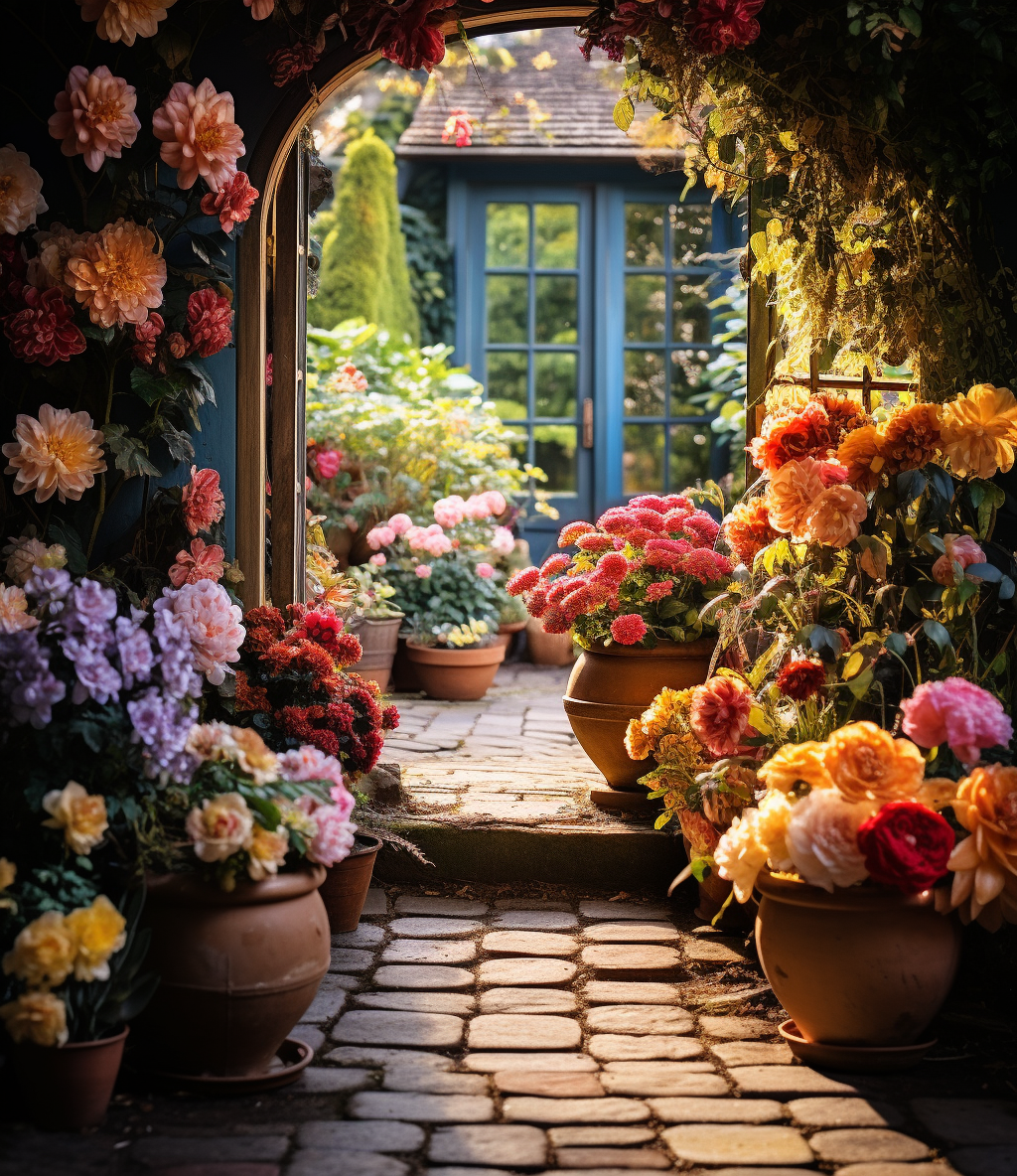
Come summer, and your garden can become a carnival of colors. Bright reds, deep blues, and sunny yellows vie for attention. Imagine geraniums, marigolds, and blue salvias setting your garden ablaze. Summer is about living fully, and your garden should reflect that energy and vibrancy.
How to Embrace the Summer Spectrum
Incorporate hardy, drought-resistant plants like zinnias and petunias that not only thrive in summer but also bring vivid colors. For a tropical touch, you can even consider canna lilies with their bright oranges and reds.
Autumn Warmth: The Cozy Blanket of Colors
As the air turns crisp and the leaves start to fall, your garden can transition into a warm, inviting space. Autumn is about oranges, reds, and yellows—the colors of pumpkins, falling leaves, and golden sunsets. It’s the garden putting on a cozy sweater.
How to Create an Autumnal Atmosphere
Consider planting chrysanthemums, asters, or even orange-hued ornamental peppers. Late-blooming perennials like sedum can also add interesting textures along with warm colors.
Winter Hues: The Quiet Elegance
Winter gardens have a unique, understated beauty. The colors are more subdued, focusing on evergreens, berries, and the occasional winter-blooming flower like a hellebore.
How to Craft a Winter Palette
Evergreen shrubs like boxwood or holly can provide a constant color background, while winterberries can add dots of red to a snowy landscape.
🍁 Pro-Tip: Seasonal Planting Calendar
Create a planting calendar that aligns with the colors you want for each season. This way, you’re never at a loss when a season transitions; you already have the next wave of color lined up. 🗓️
Brush Strokes on Earth: Implementing Color Theory Principles into Your Garden
Ah, the paintbrush of nature! We’ve looked at how each season brings its own palette, but did you ever stop to wonder how these colors work together so harmoniously? It’s almost as if the world is a canvas, and Mother Nature herself is the artist. And just like an artist, you too can implement the principles of color theory to make your garden a masterpiece.
Creating Focal Points: The Heartbeat of Your Garden
In every piece of art, your eyes are often drawn to a focal point, a center of interest. Your garden is no different. Focal points create a sense of balance, drawing the eye to certain parts of your landscape.
How to Master Focal Points
Choose vibrant colors like red, orange, or even bright white to serve as focal points. These colors naturally draw the eye. Plants like Red Hot Pokers or white roses can be excellent for this. Place them at the end of a pathway or in the center of a flower bed to capture attention.
Using Color for Spacing and Depth: It’s All About Perspective
Just like in a painting, you can use color to create an illusion of space and depth in your garden.
How to Utilize Color for Spacing
To make a small garden look larger, use cool colors like blues and purples at the far end, as they appear to recede. For a closer, more intimate feel, use warm colors like reds and oranges as they seem to advance towards you.
Emotional Landscaping: The Colors that Speak to the Soul
Each color not only looks different but also feels different. Reds can be exciting, blues calming, and greens reassuring. When planning your garden, consider the emotional impact you want it to have.
How to Achieve Emotional Landscaping
If you want a calming space, consider plants with shades of blue like lavender or morning glories. For an energizing spot, reds and yellows from poppies or sunflowers can work wonders.
The Symphony of Contrast and Harmony
Balancing colors is not just about individual hues; it’s about how they interact. Pair contrasting colors to make each stand out or use harmonious colors for a more cohesive look.
How to Balance Colors
To achieve contrast, pair colors that are opposite on the color wheel, like purple and yellow. For harmony, choose colors next to each other on the wheel, such as blues and greens.
🌈 Pro-Tip: The 60-30-10 Rule
An age-old principle in interior design, the 60-30-10 rule can be applied to your garden as well. Use a dominant color for about 60% of the garden, a secondary color for 30%, and an accent color for the remaining 10%. This creates a balanced but interesting color scheme. 🎨
The Wheel in the Garden: Understanding and Applying the Color Wheel
Ah, the color wheel—a circle of hues that artists have been using for centuries to create visual masterpieces. Did you know that it holds the same magical potential for your garden too? 🎨 Just like a potter needs a wheel to mold clay, we need the color wheel to shape our vibrant garden design.
The Basics of the Color Wheel: A Friendly Introduction to Your New Garden Guide
So, what exactly is the color wheel? It’s a circular diagram of colors that helps us understand how different hues relate to one another. Simple as that. 🌈
Understanding Primary, Secondary, and Tertiary Colors
- Primary Colors: Red, blue, and yellow. These can’t be made by mixing other colors.
- Secondary Colors: Green, orange, and purple. These are formed by mixing two primary colors.
- Tertiary Colors: Think red-orange or blue-green. These are the mix of a primary and a secondary color.
Triadic Colors in the Garden: Nature’s Perfect Threes
Triadic color schemes involve three colors equally spaced on the color wheel. For example, red, blue, and yellow form a triad. They offer strong visual contrast while retaining harmony.
Creating a Triadic Garden
Choose plants that showcase these three colors. Imagine red tulips, yellow daffodils, and blue hyacinths all together—each would stand out yet perfectly blend into a harmonious display.
Analogous and Complementary Colors: The Neighbors and the Opposites
Analogous Colors
These are colors that sit next to each other on the color wheel. Think of them like friendly neighbors. You might have a section of your garden showcasing the warm hues of red, orange, and yellow.
Complementary Colors
On the opposite end are complementary colors—those directly across from each other on the color wheel. For example, red and green are complementary.
Implementing Analogous and Complementary Schemes
To create depth, you can plant a bed of blue salvia next to yellow marigolds. The complementary colors make each other pop. On the other hand, for a tranquil corner, plant shades of green and blue together.
🌱 Pro-Tip: Avoiding Color Chaos
When using multiple color schemes, consistency is key. Stick to your chosen schemes throughout different sections of your garden. It’ll provide variety without overwhelming the senses. 🌈
The Art and Science of Color Theory: Unleashing Your Garden’s Emotional Impact
Have you ever wondered why some colors make you feel energized, while others soothe your soul? Just like a heartwarming painting or a captivating photograph, your garden is a canvas for emotions. Let’s embark on a colorful journey to understand the psychological and visual aspects of colors in your vibrant garden design.
The Psychological Impact of Colors: More Than Meets the Eye
Colors do more than just please our eyes; they tap into our deepest feelings and memories. Red, often associated with love and passion, can bring energy and attention to a part of your garden. Blues and greens, on the other hand, have calming effects.
Choosing Emotion-Centric Plants
To harness the emotional power of colors, consider planting flowers that align with the feelings you want to evoke. Lavenders and blues can create a tranquil corner, while red roses or geraniums can add a burst of excitement.
Creating Focal Points: The Stars of Your Garden Stage
Every painting has a focal point that draws you in. Similarly, your garden can have areas that capture attention. Utilize contrasting or complementary colors to make these areas stand out.
Layering for Visual Complexity
Think of your garden as a layered cake. The background, mid-ground, and foreground can all have different shades and textures to create a rich visual experience.
Pro-Tip: Playing with Light and Shadow
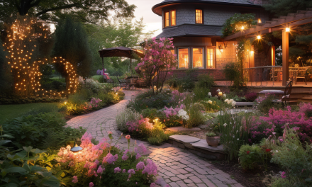
Don’t forget about the role light plays in your garden. The same flower can appear differently under morning, noon, and evening light. Experiment with positioning and perhaps add some landscape lighting for nighttime ambiance.
Final Thoughts and Resources: Your Takeaway for a Vibrant Garden
The journey through the emotional and visual landscape of your garden’s color scheme is akin to crafting a masterpiece. Whether you’re channeling Monet’s pastels or Van Gogh’s vivid hues, the choices you make are a reflection of your personal style and emotional desires. Let’s tie up all those colorful threads and give you the resources to make your garden a radiant reflection of you.
A Quick Recap: Your Garden, Your Palette
We’ve explored the psychological impact of colors, how to create focal points with contrasting or complementary hues, and even delved into the role of light. Your garden is not just soil, water, and plants. It’s a living, breathing artwork that evolves with the seasons and your own personal growth.
Thank you for walking this vibrant path with me. Your garden, like life itself, is an ever-evolving tapestry of experiences and emotions. Take these insights and resources, and turn your green space into a sanctuary that reflects the full spectrum of your personality and feelings. 🌼🎨
Amazon and the Amazon logo are trademarks of Amazon.com, Inc, or its affiliates.AMAZON AFFILIATE DISCLOSURE The Garden Whisperer Tips blog is a participant in the Amazon Services LLC Associates Program, an affiliate advertising program designed to provide a means for sites to earn advertising fees by advertising and linking to Amazon.com. As an Amazon Associate, we earn from qualifying purchases. Some of the links on this blog are affiliate links, and if you go through them to make a purchase, we will earn a commission at no extra cost to you. AFFILIATE MARKETING AND ADVERTISEMENT TRANSPARENCY At Garden Whisperer Tips, we believe in full transparency with our readers. We participate in multiple affiliate marketing programs, and some of the links on this blog may be affiliate links. This means we may earn a commission if you click on the link or make a purchase using the link. We also host advertisements on our blog, which helps us generate revenue. Rest assured, our editorial content is not influenced by advertisers or affiliate partnerships.
